
Tags
Kitchen Towel in Colors and Checks
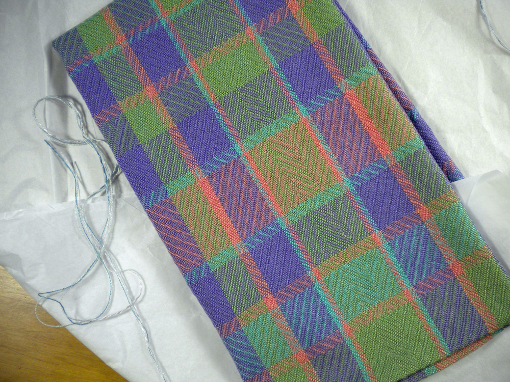
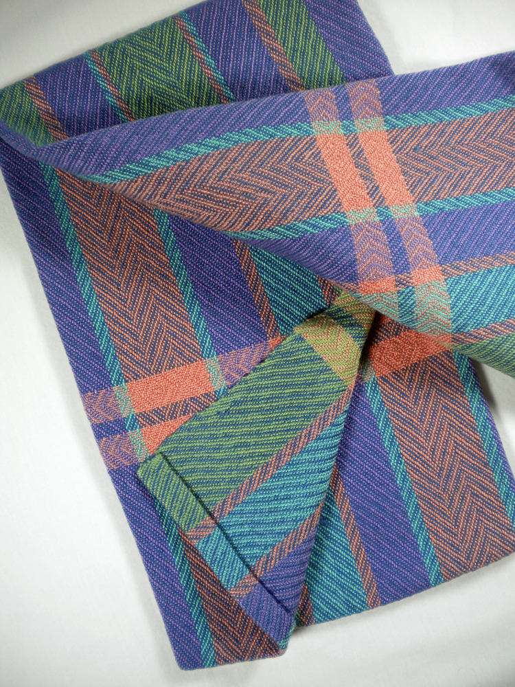
Continuing last week’s color contemplations, I wove on, and now the warp is finished and off the loom.
I had wondered if the colors would work. I chose UKI’s Scarab, Quince, Duck, and Lavender. For the record, “Duck” is what I would call a muted turquoise; “Scarab” is what I would call a soft apple green, and “Quince” looks like peach more than orange. And for the most part, I think these colors did play well together. They are similar in value but do come from different regions on the color wheel.
Kitchen Towel Stripes and Lavender
In weaving, it’s not just about how colors will look next to each other, but also how the eye will “read” them from a distance when weft crosses warp. In that respect, two of my choices didn’t work as well as the others. When crossing, Scarab and Duck simply greyed each other out. I was careful not to place them side by side in the warp, but when I used one of them as weft, it necessarily crossed the warp stripe of the other.
There are always surprises. I’m surprised at how the Scarab pops here. On the cone, it is a soft green, but with the other colors, it fairly jumps off the fabric. And depending on the lighting and what it’s next to, the Quince make look gold or pink.
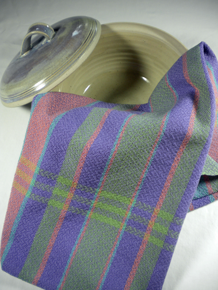
On one pair of towels I used a denim blue weft, a color I thought would recede and allow the warp stripes to stand out. It did just that, as well as softening the whole look in a nice way.
Color is such a subjective thing. What pleases my eye may jar yours. What is soothing or cheerful to one may be distracting and brash to another. While manufacturers may set their “Color of the Year” and expect us to follow their lead, sometimes I just want to break out in my own melody and scheme.
Kitchen Towel Stripes and Denim
I have only looked through the window of the whole study of color theory. Someday, I may walk right in and commit to a more thorough exploration, but for now, I note what seems to work on the loom and go on from there. This was a fun project and having made notes on the results, I will continue to learn and continue to be surprised.
What color experiments are you working on?

It’s very interesting to see your examples! I think the color combo is very appealing–but I’m not sure I would’ve predicted it to turn out so well. The biggest difficulty I’m having with color in weaving is what you mention–the ways the colors change when weft meets warp. I need tons more experience . . .
I try to keep a small sample from these colorful warps for future reference. This little collection helps me see the woven effect and gives me some guidance. Always learning!