• Home
  • Shop
  • About
  • Exhibits
  • Contact me

jeanweaves

~ Jean Williams, Handweaver

jeanweaves

Tag Archives: Color

Color Perception

03 Wednesday Jul 2019

Posted by jeanweaves in Color

≈ 4 Comments

Tags

Color, Weaving

Most of us have a favorite color. Mine is green. Or maybe blue. Some will say fire engine red or tangerine orange. I know some little girls who have to have everything purple.

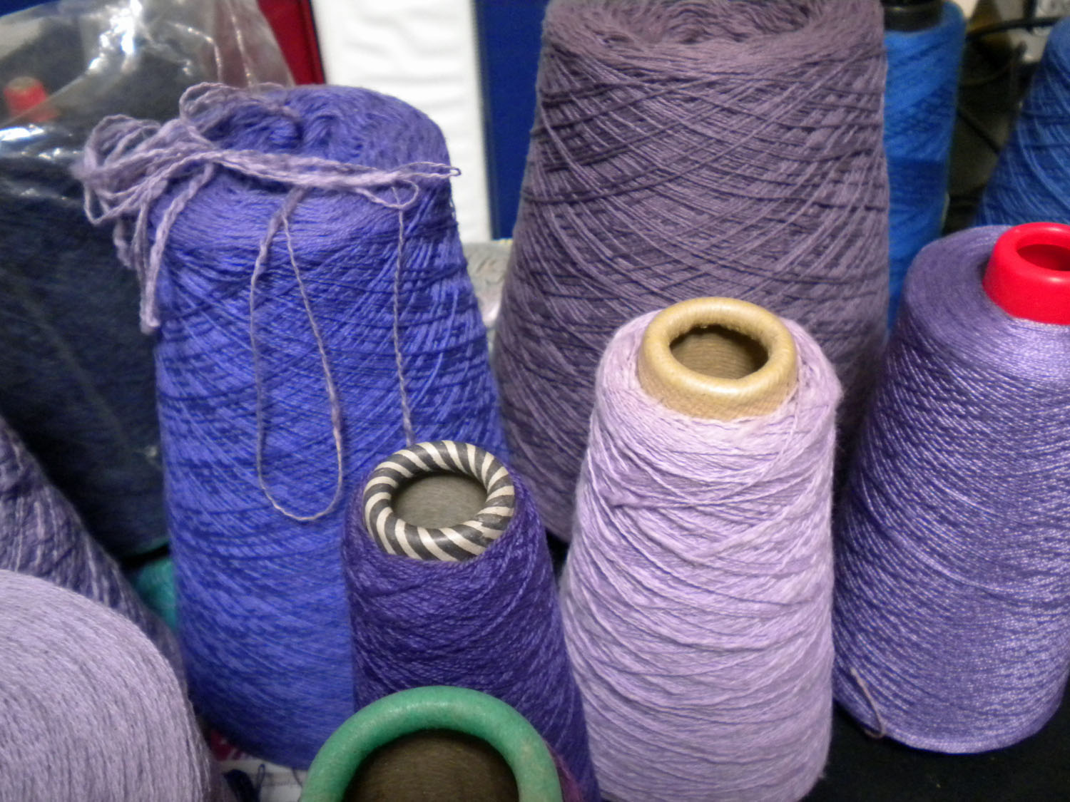
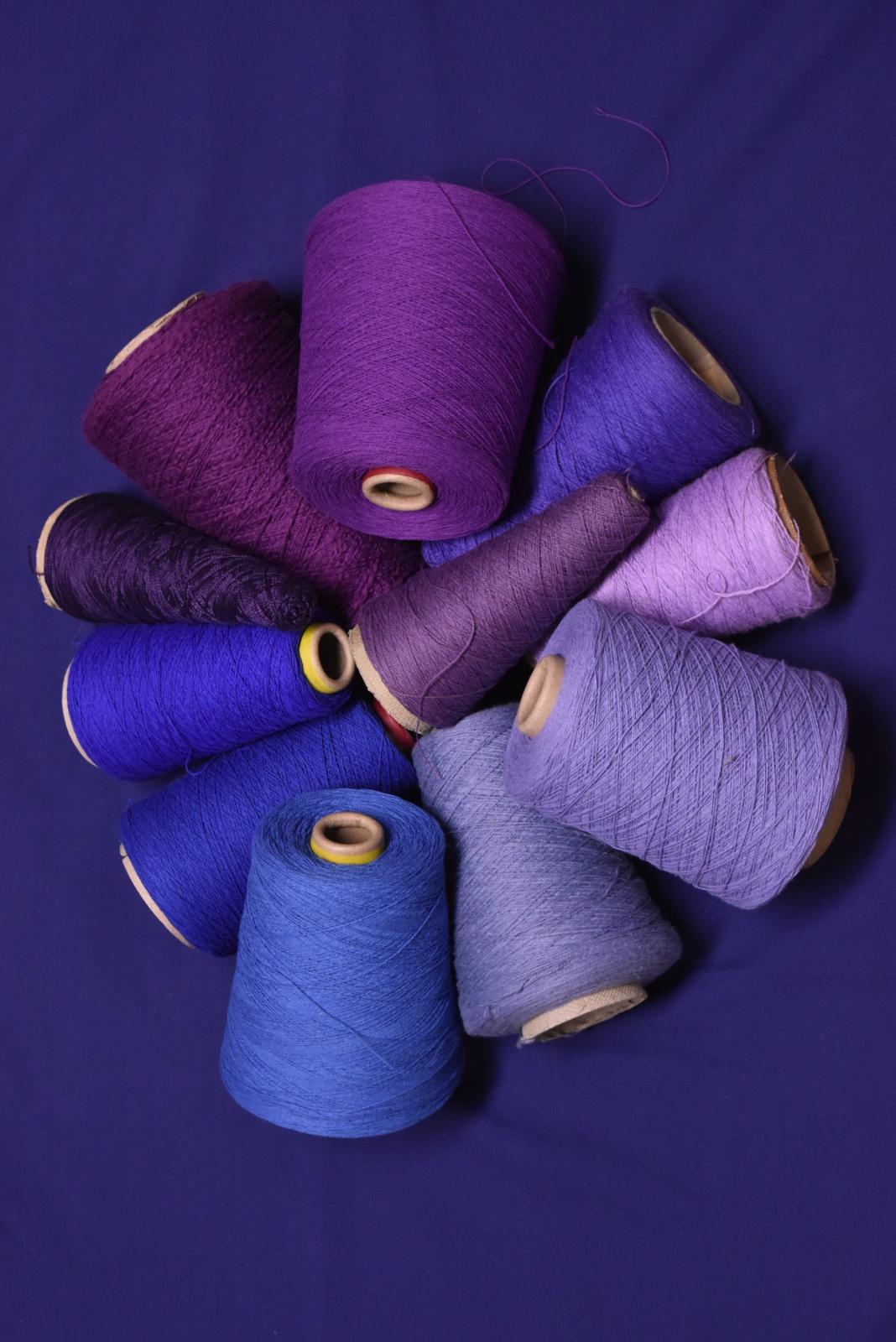
Funny thing is, what I call purple may not match what they think of as purple. Purple to one person may look like red-violet to another.

Woods in the spring

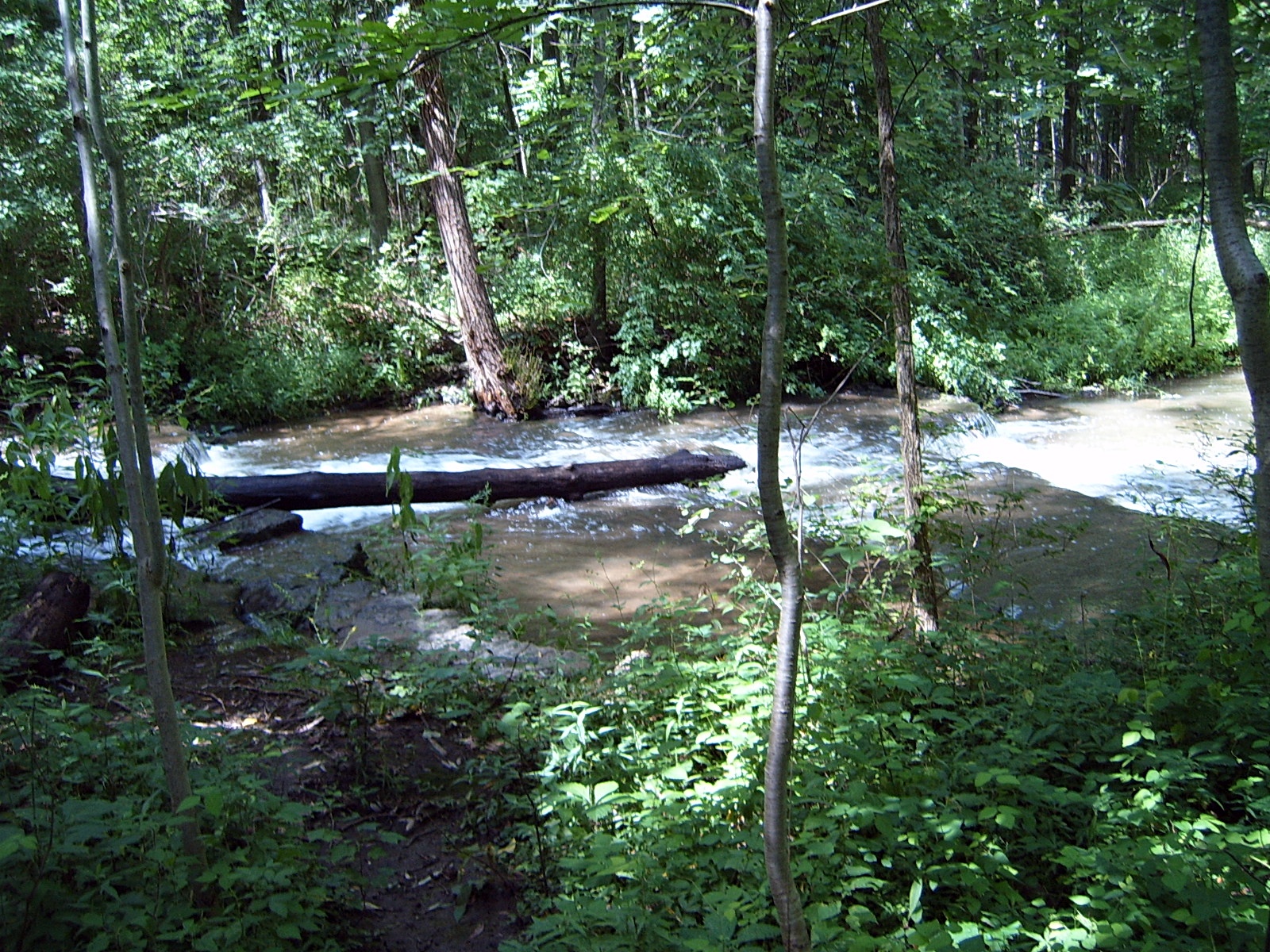
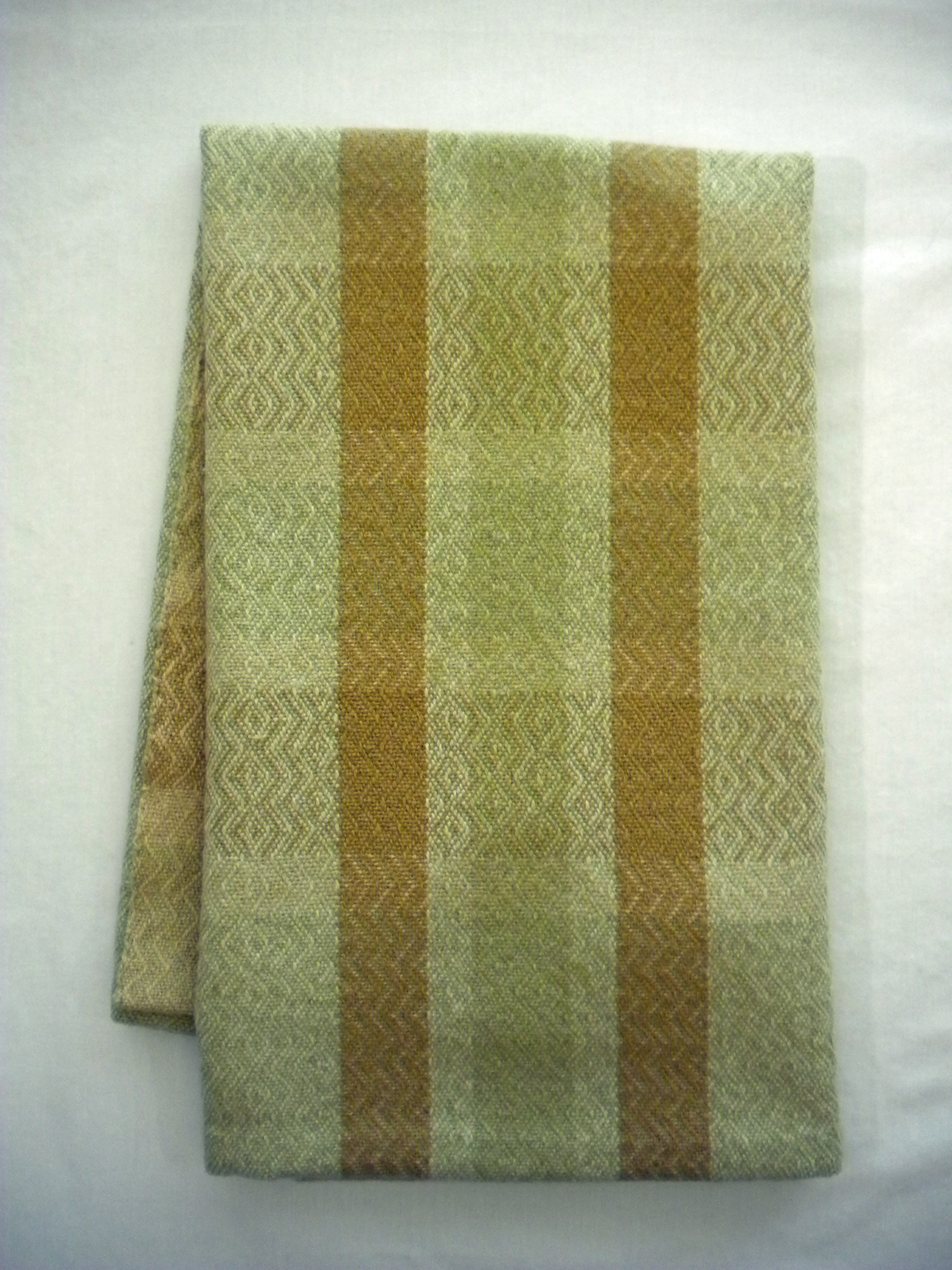
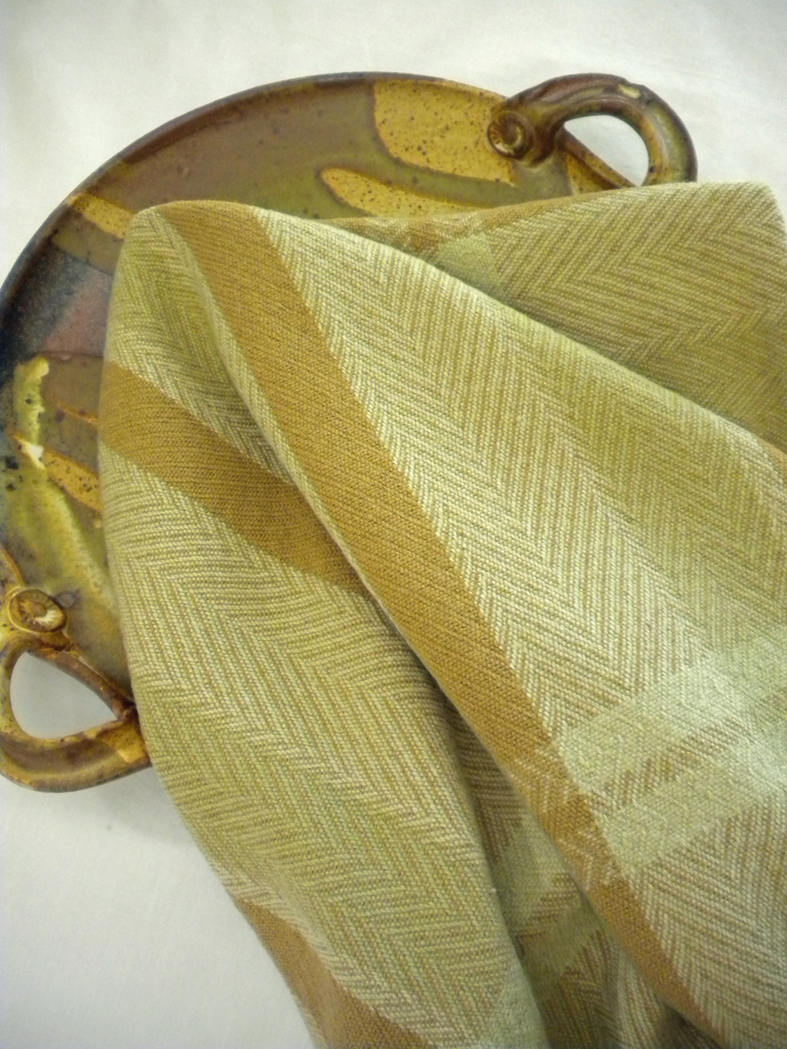
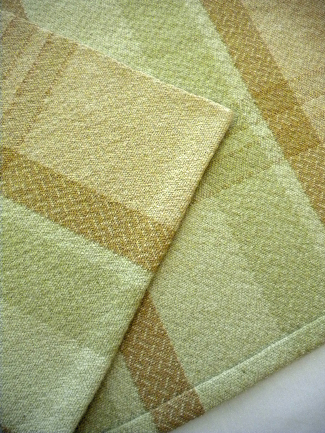
My favorite green comes from a northern woods in early summer, before the heat dusts all the leaves. An intense green with blue and yellow overtones. Can you see it? Just picture a woody stream with the sunlight streaming through the branches.

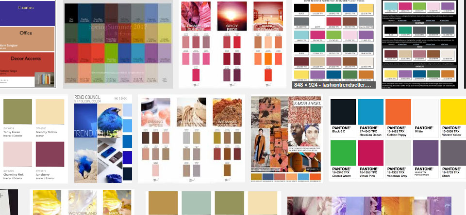
For every hue, there are shades, tints, tones, and temperatures depending on how much black, white, gray, red or blue is mixed in. A color can be warm (more red) or cool (more blue). And for every shade, tint, and tone, there are some really great names for them.

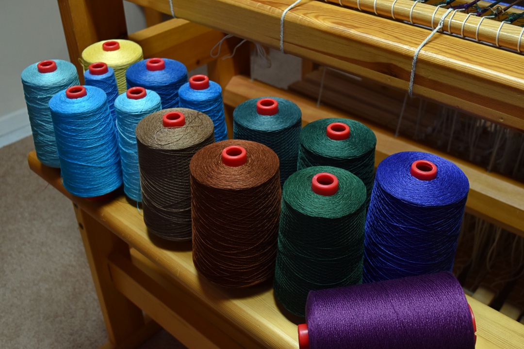
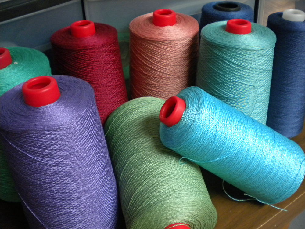
Sierra (deep brown). Yale (dusty blue). Sapphire (which actually looks more green than blue to me). Grotto (light lavender). Summer Glade (soft light green). Light red. Dark red. In one yarn company’s line, the light red is darker than the dark red. Go figure.

Yarn isn’t the only medium where colors boggle the mind. Just stand in front of the paint chips at the hardware store – the color choices are overwhelming. Many paint displays allow you to change the lighting so you can better match what’s in your home. What looks light blue in incandescent light may look white in fluorescent light.

Purple and blue yarn on white background
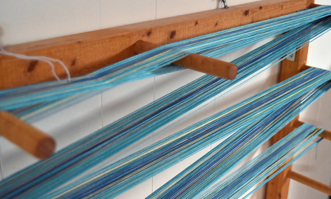
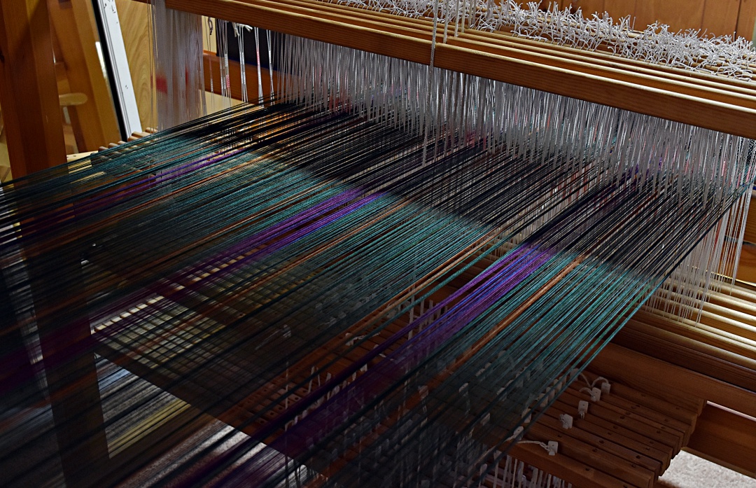
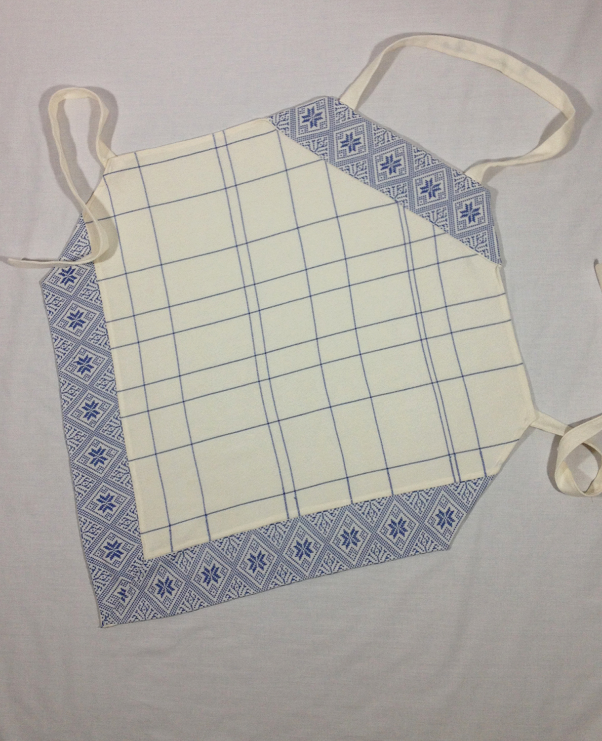
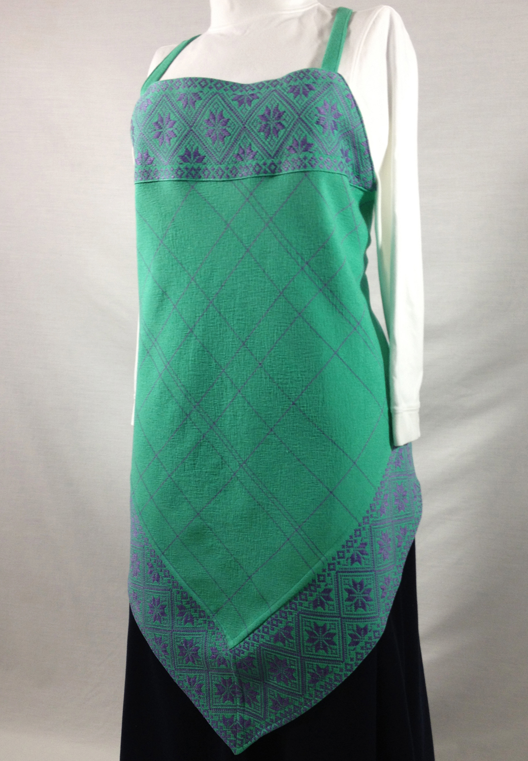
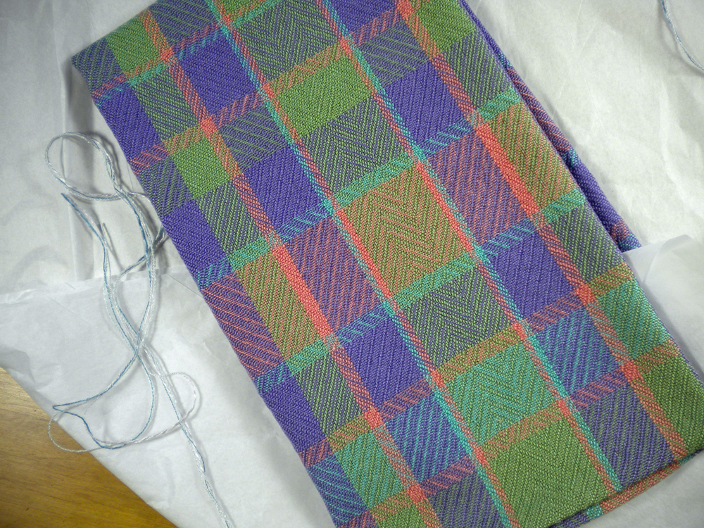
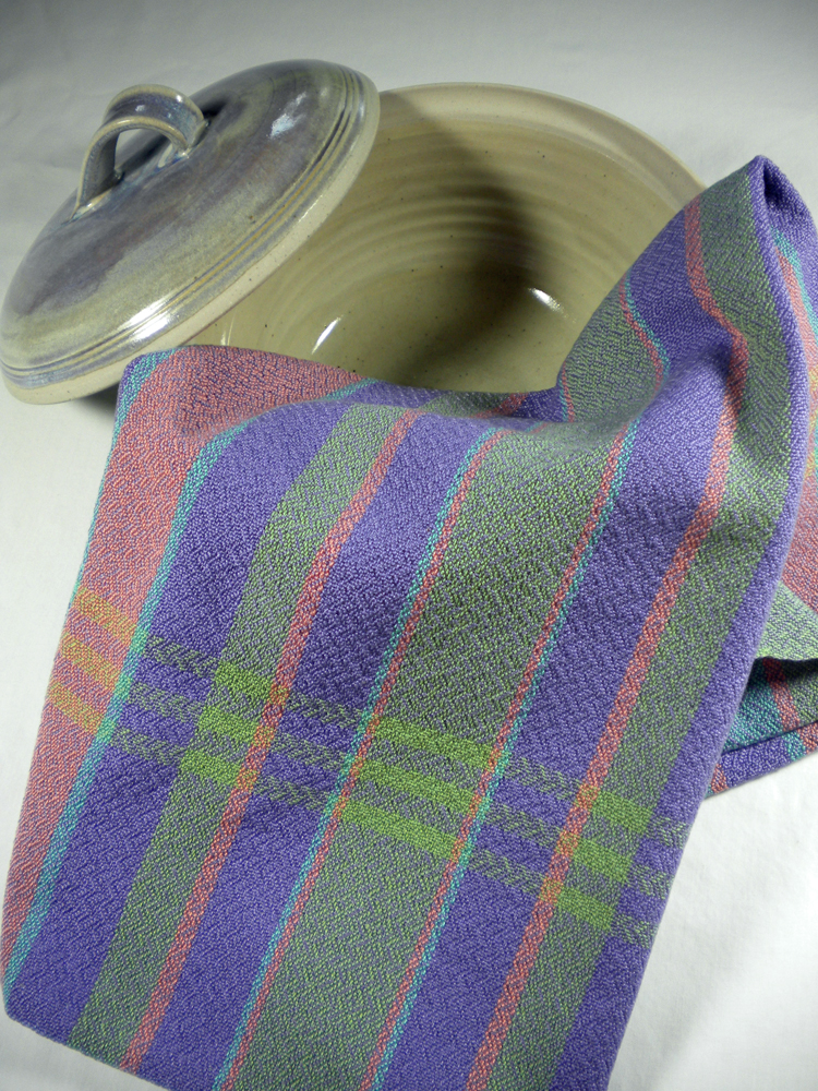
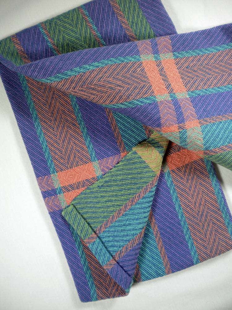
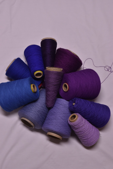
How we see a color is affected by its surroundings. Put purple yarn on a light background, then on a dark background. Same yarn, different perspective.

A gray circle on a white background will look darker than that same gray circle place on a black background. A room with windows facing west or south will get more yellow light than a north-facing room. Put a shady tree outside those windows and the color changes.

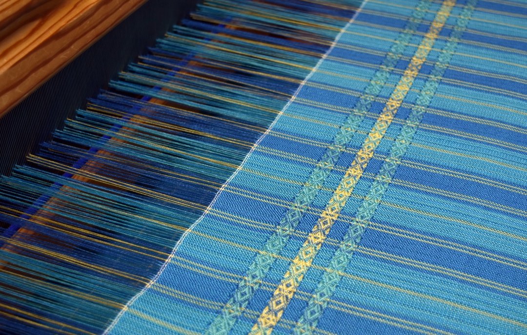
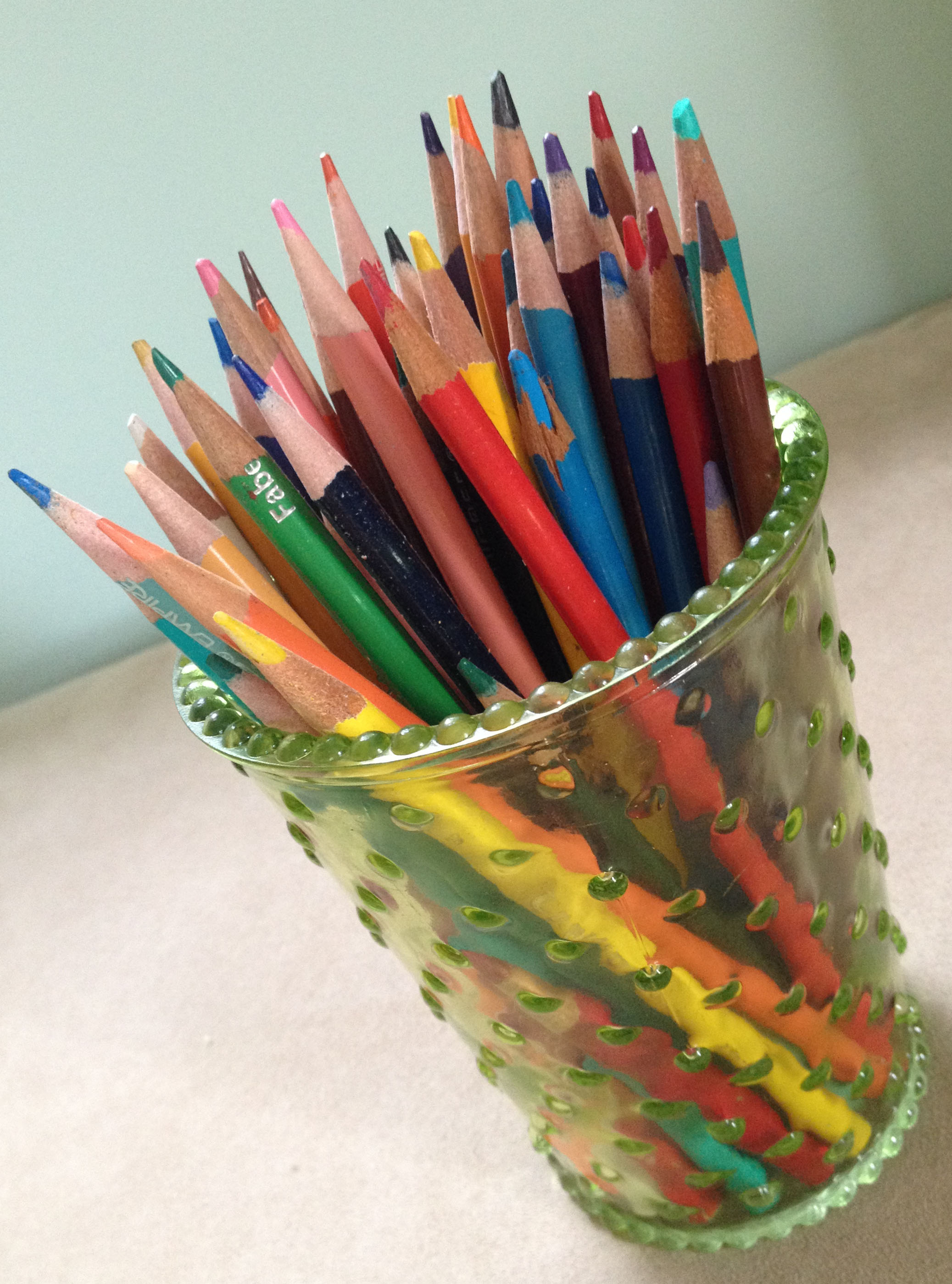
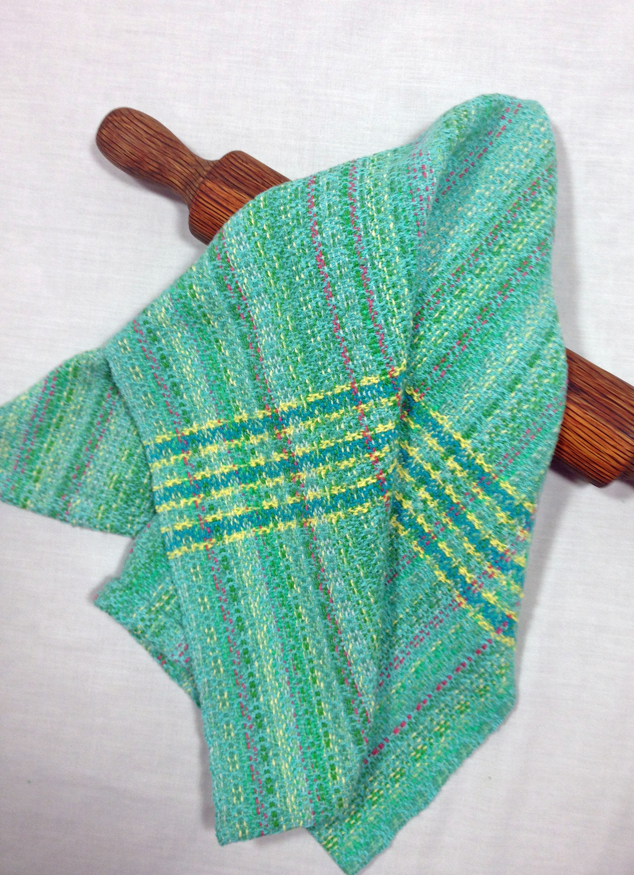
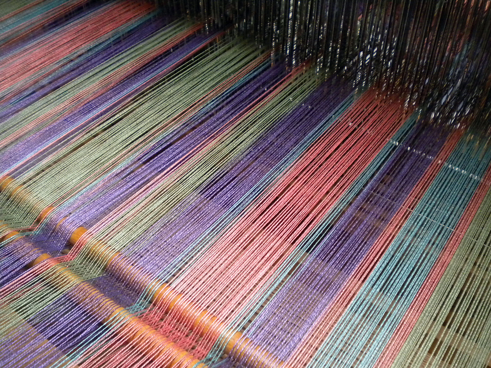
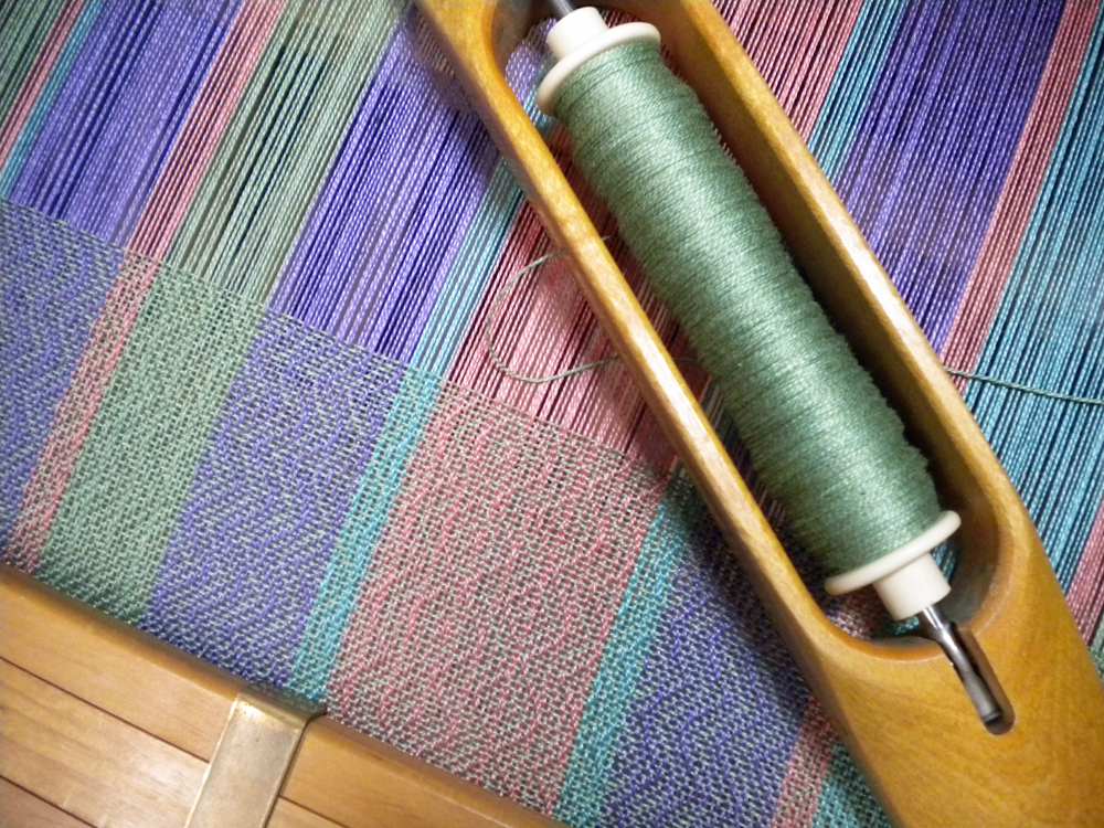
Practically speaking, one of the first decisions I make when planning a weaving project is the color. If I want to make something green, but don’t have enough of the right green, how can I blend what’s on my shelf to make what’s in my head? Sometimes adding an accent of a complementary color will intensify the main color. Too much of that complementary though will just gray it out.

Color is very personal. Everyone has one or two favorites, colors they gravitate toward and feel comfortable with. Mine is green. What is your favorite color?

Advertisement

“Plays Well With Others”

26 Monday Nov 2018

Posted by jeanweaves in Color, Uncategorized

≈ 2 Comments

Tags

Color, Design, Textiles, Weaving

dsc_1061a111At a recent guild meeting we watched a portion of Laura Bryant’s DVD “A Fiber Artist’s Guide to Color.” She discusses how to arrange colors so that they don’t “fight” against each other. That reminded me of elementary school report card behavior comments:

  • Follows directions
  • Completes assignments
  • Expresses ideas clearly
  • Does neat thorough work
  • Plays well with others

Do the colors I pick for any given project follow my mental directions in the warp and weft? Do they express my ideas of what that fabric should look like? Do they “play well with others”?

dsc_1055a111

Laura took the audience through several exercises demonstrating how our perception of colors is affected by all the other colors around them. Putting a purple patch over a white background or a blue background affects how that purple looks. Our eyes will “see” it as different when it is actually the same.

Watching her exercises, I recalled a “problem child” cone of yarn I have that doesn’t play well with others. It’s called “Bluebird” and by itself, is a delightful purple which leans toward blue. But just try to blend it with other purples or even with reds and it becomes either a bully by standing out like a neon light or is itself bullied into a non-descript gray.

I can blame some of this on my camera or my lighting, but this cone of yarn is often the culprit when I can’t get a towel to photograph well. It’s a case of the background color either highlighting the accent or pulling all the color out of it. What I need to figure out is the happy medium.

I do a lot of color-blending in my warp and it’s fun to see which cones work together and which ones I have to save for another project. That’s what makes each project unique, each towel “expressing ideas clearly” and “playing well with others.”

……..

Don’t forget the holiday specials going on in my Etsy shop. I am offering 10% off on any orders over $75. Just enter the code HOLIDAY18 at check-out. And if you order on today, November 26, your treasure will ship for free.

A Rose by Any Other Name

15 Monday Jan 2018

Posted by jeanweaves in Color

≈ 1 Comment

Tags

Color, Weaving

“A rose by any other name would smell as sweet.” William Shakespeare’s Juliet made that argument in “Romeo and Juliet.” I would add, a color by any other name …

Blending colors on the warping board

Blending colors on the warping board

I ran into a color conundrum recently. My husband needed a pair of gray slacks for work to replace a worn pair. I went to a local department store, but all they had on hand were navy, black, and khaki in his style and size. Same story in the other local department stores. You’d think gray was something rare.

Next stop—on line. Ah-ha, “Dark Pebble”! Sound like gray to me. What do you think? I hit “submit order” and waited. When the “dark pebble” slacks arrived, they didn’t look like gray. They looked a little too brown to me; well maybe a little gray, but definitely not the same color as the worn pants. In fact, they were the same color as the pants I call taupe that are already hanging in the closet.

Left to right: Worn grey, worn taupe, new "dark pebble"

Left to right: Worn grey, worn taupe, new “dark pebble”

What’s “dark pebble” to them sure looks like “taupe” to me.

The incident reminded me of the “purple” bedroom in my childhood home. When it came time to paint, my mother chose a lovely lilac for their bedroom. The painter came, a crusty old local contractor. He took one look at the color choices, and shook his head. “Who paints a bedroom purple!” He and my mom went round and round about the color, but my mom insisted and the color did look quite nice when all was said and done.

What’s lilac to one person is purple to another.

Color is very subjective and color names can be misleading. Even something as seemingly straight forward as “navy” can range from deepest dark to decidedly lighter. Add variations in dye lots and it can be quite the challenge matching one yarn to another.

Medium blended blues

The medium blue bands are actually two shades of the same blue

One of my favorite weaving work-arounds is blending colors. On a recent project, I used two yarns of the same name, same company, but purchased some time apart. They looked decidedly different. If I had used first the older cone, then the newer, the change would have been noticeable. To lessen the difference, I wound the strands side-by-side. At a distance, the eye blends those close shades and the color looks uniform.

This also works with different colors of close hues or shades. Blending the colors across the warp adds interest to fabric, and can give the effect of more colors than you actually have in the warp. Combine three colors to make five or six. Multiply five into 15 or more.

Playing with colors can brighten cold, gray days of winter–no matter what color you call it!

Holiday Notes

11 Monday Dec 2017

Posted by jeanweaves in Color, Weaving Inspiration

≈ 6 Comments

Tags

Color, creative inspiration, family, Textiles, Weaving

In the past, when I worked in an office and wove on the side, all weaving stopped about the middle of November. After our local guild’s holiday show, I had to turn my attention towards preparing for the holidays.

Empty loom

Empty loom

We never knew how many would come to our Thanksgiving table, but I always enjoyed fixing the various dishes my Mom made and adding a few of my own. Gathering, shopping, baking, simmering all kept me out of the studio.

Christmas carries many of the accumulated traditions from my childhood with special holiday cookies, breads, and candies. All that in addition to school programs, gift-making, cleaning, and decorating. There just wasn’t time to do much at the loom.

Times have changed. Kids have grown. The office job is history. Now my studio is my “office” and I get to weave late into the season!

Harvest and Sea colorways

Harvest and Sea colorways

Last week I wound warp for an idea presented to me last month—aprons with pockets. I’ve woven them before, but my latest designs didn’t have the pockets. I also noticed while inventorying yarn that I have a lot of gorgeous 10/2 mercerized cotton. Put the two together and the ideas began to sprout. I have enough yarn for two warps, one that looks like grape harvest to me, and another that is more of a Caribbean feel. These colors will warm the January winds!

Harvest Apron Warp

Harvest Apron Warp

I don’t know if I’ll have time to finish these before Christmas but there’s no deadline. In between batches of cookies and writing cards, I sit at the loom and throw the shuttle. It is such a welcome, peaceful way to ponder the season.

Follow the aprons’ progress on my Facebook page, www.facebook.com/JeanWilliams.JeanWeaves

More on Opphämta

26 Friday Aug 2016

Posted by jeanweaves in Opphämta, Uncategorized

≈ 4 Comments

Tags

Color, creative inspiration, Projects, Textiles, Tradition, Weaving

Opphämta on the Loom

Opphämta on the Loom

Earlier this summer, I set out to explore opphämta and chose to put together some aprons using the patterning as borders along the sides and bodice. This has been a season-long project, but one in which I’ve learned a lot.

Because I wanted to make unique aprons, I wound only enough warp to make two aprons of each color. I also wanted to include some contrasting threads spaced randomly across the warp and weft. Since the borders and ties are woven on the same warp, this presented a bit of a challenge. Those contrasting threads interrupted the opphämpta pattern.

Royal Apron with White Opphämta Pattern

Royal Apron with White Opphämta Pattern

My first solution was to weave the body of the apron first with the contrasting threads. Then for the tie bands and patterns, I replaced those threads in the warp with the main color and weighted them off the back of the loom. This worked okay but caused a few tension issues.

White Apron with Star and Rose Pattern

White Apron with Star and Rose Pattern

I actually preferred the second solution—changing the contrasting threads on the warping board as I was measuring the warp. This did take some calculating, but the warp tension was more consistent.

My color choices were mainly pretty traditional—blue on white, white on blue. Then for the third warp, I used some seafoam green mercerized cotton that blends well with lavender. Those color studies from earlier this month came in handy.

White Apron with Star and Leaf Pattern

White Apron with Star and Leaf Pattern

Each apron uses a different opphämta design. There are so many different sources and motifs that I can spend hours playing with stars, roses, diamonds, and crosses. The scale of the pattern had to fit on the apron, so I kept my units to two threads each. With a sett of 24 epi, a five-unit float is almost ½”, so any float over five units had to be tied down.

Seafoam and Lavender Apron

Seafoam and Lavender Apron

As enjoyable as the aprons have been, I’m ready to move on. The nice thing about these opphämta patterns is that they can be used for other weave structures. Next up—damask. But what if these same units could be woven in overshot or lace or ….hmmm…

The Language of Color

12 Friday Aug 2016

Posted by jeanweaves in Color, creating, Uncategorized, Weaving Inspiration

≈ 5 Comments

Tags

Color, creative inspiration, Weaving

Color Swatches

Color Swatches

I get a kick out of perusing the color trends that come down from who knows where. Just do an internet search for “color trends for home interiors” and you can get an idea of the colors being promoted by industry. Everyone from paint companies, interior decorators, furniture manufacturers, not to mention fashion designers, all have a take on what colors we want in our homes this year.

And the names of the colors can be quite poetic. Green is not just green; it’s Lush Meadow, Nile, Malachite. Pink can be Orchid, Salmon, Peach, Rose.  Phrases like “transcendent, powerful and polarizing,” “restrained and refined,”  “serene”, tempt me to read between the lines—what color are they really talking about? What does “serene” look like? I think of the soft green of a summer meadow, but really it’s a pale sky blue.IMG_0274

This is more than a casual search for those of us who create for the home. It does little good to go to all the trouble of handweaving a piece that doesn’t go with anything in anyone’s home. I used to buy odd lots of mill end yarns because the price was right, but soon discovered that those odd lots included colors that were long out of date.

There is a down side to following the trends. It takes a good long time to plan something, weave and finish it. Will that “trendy” color still be trendy by the time my handwoven hits to market? And who redecorates completely every year? A friend of mine doesn’t watch the color trends for just that reason. She creates large quantities of items for an established line and she can’t afford to have unsold pieces sitting around because a color has gone out of style.

The upside of color trends is that they are usually pretty broad. Look at most forecasts and you are bound to find some shade of your favorite hue. And the trends from previous years will carry over to a certain degree. The Marsala and Radiant Orchid of 2015 and 2016 still show up in 2017 forecasts, even if they are not called exactly that. Even the Emerald of 2014 shows up in home interior ads.

This is especially true for those of us living outside major urban areas. Often color trends on the coasts of the U.S. take a couple years to filter into the midsection of the country.

Yarns on Hand

Yarns on Hand

But when it comes right down to it, when I’m planning a project, the colors come from my yarn on hand.  When I stock up on yarn, I focus on colors that will “play well together” over time, to make something pleasing both to me and to the person who buys it.

So that’s the creative challenge for handweavers—using the yarn on hand in ways that will complement the current color trends without being limited to what someone else says we should choose.

Cotton Kitchen Towel in Aqua and Turquoise

Cotton Kitchen Towel in Aqua and Turquoise

I am not a color theorist, nor have I done any extensive study of color. What I know, or think I know, about color comes from paying attention to what’s in the market, what yarn colors are currently available, but most of all, what I like.

Look at the yarn on your shelf. What can you make from what you have?

Inspired by Nature

05 Friday Aug 2016

Posted by jeanweaves in Color, Nature, Weaving Inspiration

≈ 4 Comments

Tags

Color, creative inspiration, Weaving

If you  scroll through my photo files, you will see landscapes, family members, fascinating flowers, and – what’s this?

That’s the reaction I get when showing trip pictures. There’s always some odd picture that is not quite identifiable. I know what it is, but my husband and other family members just scroll right past, thinking it’s a mistake.

Colorful lichen formations

Colorful lichen formations

This, from our recent trip to Wyoming, is lichen growing on the rock. Yes, I did take pictures of the area as a whole, but these colors intrigued me too. So I brought them home – on the camera! Orange, lime green, rusty tan on a background of cool gray — an interesting color relationship!

I’ve written before about my adventures in choosing colors. This rock made me think again of Sharon Alderman’s suggestion to pay attention to what colors occur in nature. She spoke about going around her neighborhood photographing tree bark, moss, and lichens. So I try to train my eyes to see the colors with the idea of perhaps using them in some woven piece.

Blues and greens in grape hyacinths

Blues and greens in grape hyacinths

And not just the colors. Notice the many shades of blue and green in these grape hyacinths, how the highlights and shadows blend together.  I can see these together in a kitchen towel. The trick sometimes is to choose an effective weft. The colors may be stunning in the warp, but choosing a weft that won’t overpower them is also important. I’ve learned from experience that darker weft colors will “recede” and lighter ones will dominate. If I want the warp colors to draw attention, then I will pick the darker color from the warp and use that as the weft.

Choosing colors from the garden

Choosing colors from the garden

Sometimes I blend colors across the warp from one hue to another, similar to a flower garden. However, a weft that will work with one of the warps may not look so good with another. That’s where I need to sample before winding on a long warp. The red and yellow of these geraniums and heliopolis may work as accent colors, and perhaps a soft green could then be the “background”, just as the grass and asparagus fern here.

And just because colors look lovely on the stem doesn’t mean they’ll look lovely in a scarf or a towel. Not every color combination will be the current trend. But it’s a good starting point, a good prompt for creatively thinking about colors.

What colors come home with you from your walks and adventures?


The Color of Cotton

28 Tuesday Jul 2015

Posted by jeanweaves in Color, Towels

≈ 1 Comment

Tags

Color, Cotton, Handwoven, Towels

Twill Towel in Naturally Colored Cotton

Twill Towel in Naturally Colored Cotton

Before my weaving days, my exposure to cotton was limited to one color: white. White t-shirts, white sheets, white hotel towels. What color there was came from dyes. And many times, that color was fugitive—over time, red turned to pink, navy turned to powder blue, and yellow faded to cream.

Then I learned to weave and of course, needed yarn. I love shopping for yarn! There are so many different fibers, different spins, and hues to choose from. And that’s when I discovered that cotton is also available in colors that come from nature!

Kitchen Towel in Naturally Colored Cotton

Kitchen Towel in Naturally Colored Cotton

Cotton has always grown in a variety of browns, tans, greens, and even reds, and many peoples over time have spun and woven beautiful naturally colored textiles. It has a shorter  staple(fiber) length than white cotton and produces a softer cloth than white cotton. And the amazing thing to me is that the color deepens with washing. I wove a series of hand towels several years ago and had a small piece left over which I kept and use as a basket liner. This little towel is still the same soft green and brown as when I wove it.

The white cotton we are familiar with today was bred in response to the Industrial Revolution. The development of inexpensive dyes and improvements in spinning and weaving manufacturing led growers to breed just that one variety. Colored cotton became a novelty until the early 1980’s when a small number of cotton breeders began developing the line again.

Kitchen Towel in Naturally Colored Cotton Twill

Kitchen Towel in Naturally Colored Cotton Twill

Remembering the towels I wove earlier, I decided to weave another run in naturally colored cotton. Cotton is a great fiber for towels, very absorbent, durable and easy to care for. And twill is my go-to weave structure for just about everything. The towels are off the loom now and I’m almost finished hemming. I’m happy with the feel of the towels and the warm colors of the cotton. And I know they won’t fade!

Color Study Continued

01 Wednesday Jul 2015

Posted by jeanweaves in Color, Towels

≈ 2 Comments

Tags

Color, Cotton, creative inspiration, Weaving

Kitchen Towel in Colors and Checks

Kitchen Towel in Colors and Checks

Continuing last week’s color contemplations, I wove on, and now the warp is finished and off the loom.

I had wondered if the colors would work. I chose UKI’s Scarab, Quince, Duck, and Lavender. For the record, “Duck” is what I would call a muted turquoise; “Scarab” is what I would call a soft apple green, and “Quince” looks like peach more than orange. And for the most part, I think these colors did play well together. They are similar in value but do come from different regions on the color wheel.

Kitchen Towel Stripes and Lavender

Kitchen Towel Stripes and Lavender

In weaving, it’s not just about how colors will look next to each other, but also how the eye will “read” them from a distance when weft crosses warp. In that respect, two of my choices didn’t work as well as the others. When crossing, Scarab and Duck simply greyed each other out. I was careful not to place them side by side in the warp, but when I used one of them as weft, it necessarily crossed the warp stripe of the other.

There are always surprises.  I’m surprised at how the Scarab pops here. On the cone, it is a soft green, but with the other colors, it fairly jumps off the fabric. And depending on the lighting and what it’s next to, the Quince make look gold or pink.

On one pair of towels I used a denim blue weft, a color I thought would recede and allow the warp stripes to stand out. It did just that, as well as softening the whole look in a nice way.

Color is such a subjective thing. What pleases my eye may jar yours. What is soothing or cheerful to one may be distracting and brash to another. While manufacturers may set their “Color of the Year” and expect us to follow their lead, sometimes I just want to break out in my own melody and scheme.

Kitchen Towel Stripes and Denim

Kitchen Towel Stripes and Denim

I have only looked through the window of the whole study of color theory. Someday, I may walk right in and commit to a more thorough exploration, but for now, I note what seems to work on the loom and go on from there. This was a fun project and having made notes on the results, I will continue to learn and continue to be surprised.

What color experiments are you working on?

Hmm…Does that work?

23 Tuesday Jun 2015

Posted by jeanweaves in Color, creating, Planning, Weaving Inspiration

≈ 5 Comments

Tags

Color, creative inspiration, Textiles, Weaving, Yarn

Winding my new warp gives me pause—do these colors work?

A choice of colors

A choice of colors

Planning colors can be one of the most difficult parts of the weaving process for me. I’ve designed some real ‘dogs’ in my years at the loom, and other times, the colors just glow. I’m definitely more of a “pattern/structure” weaver and a “color/texture” weaver.

Recently I’ve been weaving workshop samples and neutral colors, and really, this week I needed some color. So I went to my shelf and started pulling out cones. Reds, purples, blues, peach, turquoise, green. Which should I choose? Which colors will play nicely together?

Sampling would be the wise route to take, but I’m very impatient to get this one the loom. That may come back to haunt me.

Threaded warp from the back

Threaded warp from the back

I remember hearing Sharon Alderman talk about color—look at what Mother Nature puts together and use that as a starting point.

Okay. I can see some of these colors in my flower garden, but not all of them on the same stem. After some sorting, I settle on UKI’s Quince (a dark peach), Duck (close to turquoise), Lavender, and Scarab (a soft sage green) for towels. (Color names are interesting—can you just imagine someone saying “We’ve already got a green. What should we call this shade?”) As I wind the warp, I have second thoughts, but it’s too late now. Such indecision!

I sley the reed. Hmm…I hope this works.

It takes the better part of a day to thread a broken twill that will make up a vibrant towel warp—I hope! Lots of time to wonder…

Okay, today I wound the warp onto the back beam and tied the warp to the breast beam—all 642 threads, each 7 yards, 21 inches. The colors of the mercerized cotton glow. A few inches woven show that hey, this might work after all.

Testing the Warp

Testing the Warp

With house guests for the next week and a family wedding to follow, the warp will wait for confirmation. And I will still need to decide on weft colors, but every time I walk by the loom, I’ll think about these colors and dream about some nice colorful towels.

How do you choose the colors for your next project?

← Older posts
Shop!

Follow Us

  • Facebook

Galleries

  • Towels to Use and to Give
  • Runners
  • Scarves for Him and Her
  • For the Table
  • Note Cards
  • Animals
  • Throws
  • The Linen Press
  • Privacy Policy

Subscribe

  • RSS - Posts
  • RSS - Comments

Archives

  • September 2020 (2)
  • October 2019 (1)
  • August 2019 (1)
  • July 2019 (2)
  • June 2019 (2)
  • March 2019 (1)
  • November 2018 (2)
  • September 2018 (1)
  • July 2018 (2)
  • May 2018 (2)
  • April 2018 (1)
  • February 2018 (2)
  • January 2018 (1)
  • December 2017 (1)
  • November 2017 (2)
  • October 2017 (3)
  • August 2017 (1)
  • July 2017 (1)
  • June 2017 (2)
  • May 2017 (2)
  • March 2017 (2)
  • February 2017 (2)
  • January 2017 (2)
  • December 2016 (1)
  • November 2016 (1)
  • October 2016 (2)
  • August 2016 (3)
  • June 2016 (1)
  • May 2016 (1)
  • March 2016 (2)
  • February 2016 (1)
  • January 2016 (1)
  • December 2015 (1)
  • November 2015 (3)
  • October 2015 (1)
  • September 2015 (4)
  • August 2015 (1)
  • July 2015 (2)
  • June 2015 (1)
  • May 2015 (1)
  • April 2015 (2)
  • March 2015 (2)
  • February 2015 (2)
  • January 2015 (2)
  • December 2014 (1)
  • November 2014 (3)
  • October 2014 (1)
  • September 2014 (2)
  • August 2014 (1)
  • July 2014 (3)
  • June 2014 (1)
  • May 2014 (2)
  • April 2014 (2)
  • March 2014 (2)
  • February 2014 (2)
  • January 2014 (2)
  • December 2013 (2)
  • November 2013 (1)
  • October 2013 (1)
  • September 2013 (3)
  • August 2013 (1)

Blog at WordPress.com.

Privacy & Cookies: This site uses cookies. By continuing to use this website, you agree to their use.
To find out more, including how to control cookies, see here: Cookie Policy
  • Follow Following
    • jeanweaves
    • Join 62 other followers
    • Already have a WordPress.com account? Log in now.
    • jeanweaves
    • Customize
    • Follow Following
    • Sign up
    • Log in
    • Report this content
    • View site in Reader
    • Manage subscriptions
    • Collapse this bar
 

Loading Comments...