
Tags
If you scroll through my photo files, you will see landscapes, family members, fascinating flowers, and – what’s this?
That’s the reaction I get when showing trip pictures. There’s always some odd picture that is not quite identifiable. I know what it is, but my husband and other family members just scroll right past, thinking it’s a mistake.

Colorful lichen formations
This, from our recent trip to Wyoming, is lichen growing on the rock. Yes, I did take pictures of the area as a whole, but these colors intrigued me too. So I brought them home – on the camera! Orange, lime green, rusty tan on a background of cool gray — an interesting color relationship!
I’ve written before about my adventures in choosing colors. This rock made me think again of Sharon Alderman’s suggestion to pay attention to what colors occur in nature. She spoke about going around her neighborhood photographing tree bark, moss, and lichens. So I try to train my eyes to see the colors with the idea of perhaps using them in some woven piece.
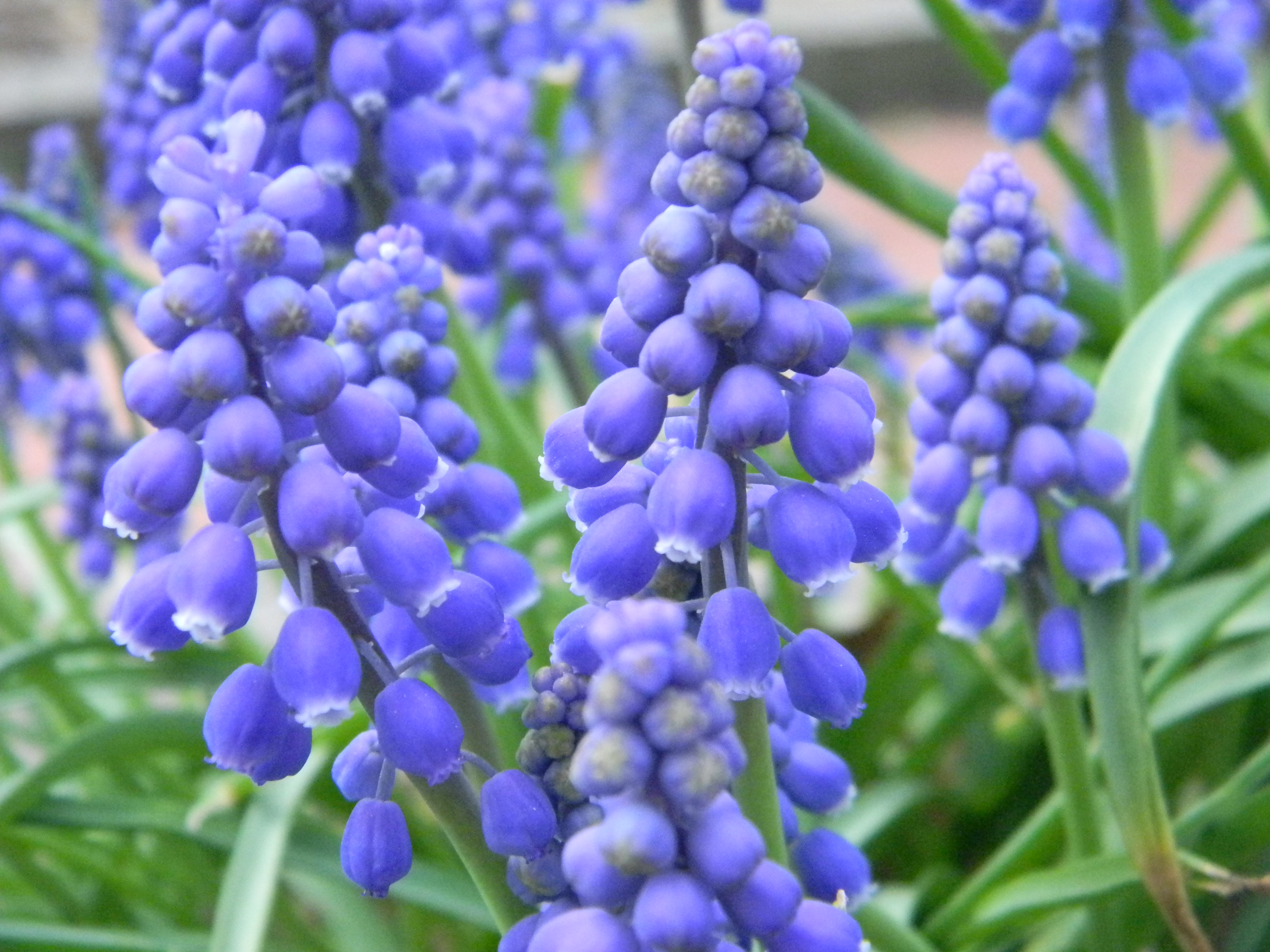
Blues and greens in grape hyacinths
And not just the colors. Notice the many shades of blue and green in these grape hyacinths, how the highlights and shadows blend together. I can see these together in a kitchen towel. The trick sometimes is to choose an effective weft. The colors may be stunning in the warp, but choosing a weft that won’t overpower them is also important. I’ve learned from experience that darker weft colors will “recede” and lighter ones will dominate. If I want the warp colors to draw attention, then I will pick the darker color from the warp and use that as the weft.
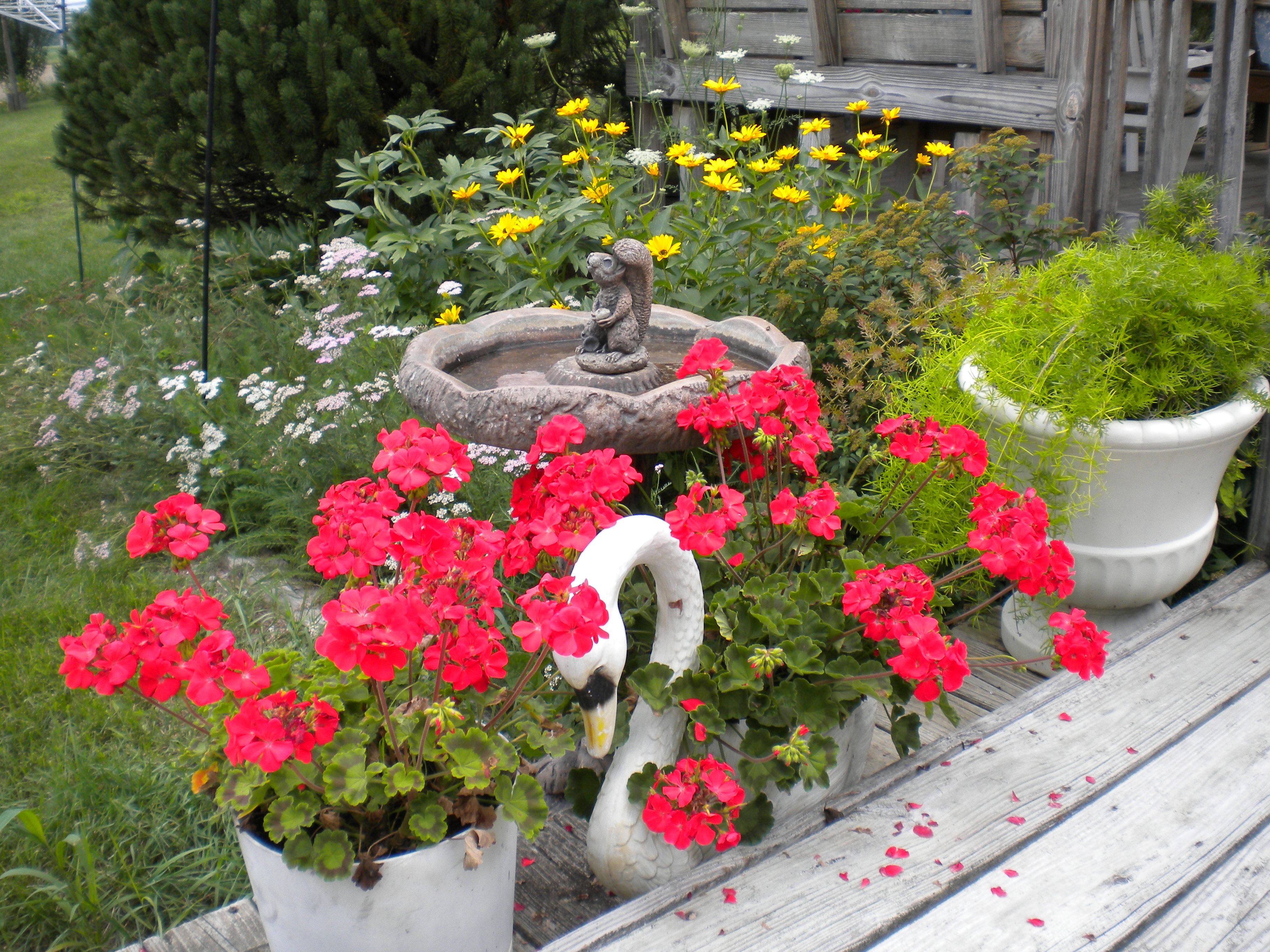
Choosing colors from the garden
Sometimes I blend colors across the warp from one hue to another, similar to a flower garden. However, a weft that will work with one of the warps may not look so good with another. That’s where I need to sample before winding on a long warp. The red and yellow of these geraniums and heliopolis may work as accent colors, and perhaps a soft green could then be the “background”, just as the grass and asparagus fern here.
And just because colors look lovely on the stem doesn’t mean they’ll look lovely in a scarf or a towel. Not every color combination will be the current trend. But it’s a good starting point, a good prompt for creatively thinking about colors.
What colors come home with you from your walks and adventures?

I love being out in nature, right now by birding in some fantastic salt marshes. Generally I think my design inspiration builds on the materials I have to hand, though I do have some galah (pink and grey parrot) dish towels simmering away on my mental mood board.
Yes, my weaving is often also limited to yarn on hand. It’s a case of making do, but that can push me to be creative. Those pink and grey towels sound nice–can’t wait to see them!
Choosing colors is definitely a hard part of the process for me–I am very weak at visualizing what I am going to end up with. Your suggestions are very useful!
And even when I do picture colors as playing nicely together, they don’t always! I should make better use of all my workshop sample binders.